"OkCars- 22k Crossroads" (okcars)
01/30/2015 at 15:39 • Filed to: None
 3
3
 6
6|
"OkCars- 22k Crossroads" (okcars)
01/30/2015 at 15:39 • Filed to: None | 3
| 6 |
The banco do brasil ad sucks. It looks like its just pasted or sewn in the last minute.

 Zerofret
> OkCars- 22k Crossroads
Zerofret
> OkCars- 22k Crossroads
01/30/2015 at 15:43 |
|
agreed.
 jariten1781
> OkCars- 22k Crossroads
jariten1781
> OkCars- 22k Crossroads
01/30/2015 at 15:43 |
|
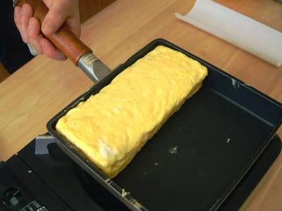
I see an omelette in an omelette pan
|
OkCars- 22k Crossroads
> jariten1781
01/30/2015 at 15:45 |
|
lol. the same thing
 ttyymmnn
> OkCars- 22k Crossroads
ttyymmnn
> OkCars- 22k Crossroads
01/30/2015 at 15:50 |
|
I'm sure Banco do Brasil thinks it looks fabulous. I'd be interested to know how much the rent is on that space.
 ranwhenparked
> OkCars- 22k Crossroads
ranwhenparked
> OkCars- 22k Crossroads
01/30/2015 at 15:55 |
|
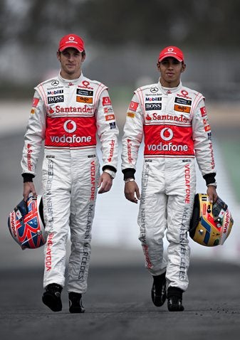
They could have at least continued the yellow all the way around as a stripe, but, all things considered, I think F1 still does a much better job of integrating sponsor ads into a cohesive design than Nascar.
|
OkCars- 22k Crossroads
> ranwhenparked
01/30/2015 at 16:04 |
|
They should have, like the vodafones